RE- Spatial-temporal and content analysis of Twitter Data
Replication of
Spatial, temporal and content analysis of Twitter data
Original study by Wang, Z., X. Ye, and M. H. Tsou. 2016. Spatial, temporal, and content analysis of Twitter for wildfire hazards. Natural Hazards 83 (1):523–540. DOI:10.1007/s11069-016-2329-6. and First replication study by Holler, J. 2021 (in preparation). Hurricane Dorian vs Sharpie Pen: an empirical test of social amplification of risk on social media.
Replication Author: Emma Brown
Replication Materials Available at: emmab725/twitter-analysis
Created: 5 May 2021
Revised: 10 May 2021
Abstract
As social media becomes more prominent in everyday life among many generations, it can be a useful tool in disseminating information, especially related to emergency events and preparedness. Wang et al.’s study analyzes the spatial and temporal patterns of wildfire-related tweets in attempt to analyze the content as well as evaluate the role of “opinion leaders” during these disasters.
Wang et al. (2016) analyzed Twitter data for wildfires in California, finding that the social media data can enhance “situational awareness and provide useful information on disaster situations. By analyzing the spatial and temporal patterns of these wildfire-related tweets, Wang et al. were able to characterize the disaster across space and time. By conducting a network analysis, they were also able to evaluate how disaster-related information was spread, and who the dominant users spreading this knowledge were.
Holler (2021) is studying Twitter data for Hurricane Dorian on the Atlantic coast, finding that in spite of tending news and social media content regarding a false narrative of risk, original Tweets still clustered significantly along the real hurricane track, and only along the hurricane track.
Reproducing and replicating spatial research of Twitter data continues to be relevant as social media continues to grow as a prominent news source. However, there are ethical questions and concern that arise when using this data involving consent and transparency of the data use. Read more about the ethics of volunteered geographic information (VGI) here.
In this replication study, I will analyze tweets about the Covid-19 vaccine to explore the question: are patterns of social media activity about the Covid-19 vaccine representative of Covid-19 vaccination rates? It is interesting to replicate Wang et al. (2016)’s study with Covid-19 vaccine data as it allows us to see where the vaccine is more widely talked about, which could indicate areas with higher vaccination rates. This will give insight to the social demographic makeup of the United States regarding the vaccine.
Original Study Information
Wang et al. (2016)’s study used Twitter data to analyze their “attributes pertinent to space, time, content, and network” to reveal “situational awareness” during California wildfire events. Situational awareness is defined as “perception of elements in the environment within a volume of time and space, the comprehension of their meaning, and the projection of their status in the near future.”
Wang et al. (2016)’s analysis consisted of three main parts: a kernel density analysis, a content analysis, and a network analysis.
Kernel density estimation (KDE) was used to analyze the spatial pattern of tweets, identifying “hotspots” of the spatial point data. Dual KDE was employed to filter out the influence of population.
This was followed by a content analysis consisting of two parts. Text mining, which identified clusters of words that appeared in the same tweets helped to identify the topics that were being tweeted about, while a social network analysis analyzed the behavior of retweets, identifying “opinion leaders” throughout these crises. The text mining section used the “tm” package in R. The tweets were cleaned by removing stopwords, and the frequency of the terms were calculated to check the variation in importance. The k-means clustering method identified clusters where terms appeared in the same group, which helped to glean what topics were included in the tweets. This information is shown in a table. The social network analysis was performed using the “igraph” package in R, however the methodology is not mentioned in the paper. This method highlights the “opinion leader” users who played a key role in sharing information.
Holler (2021) loosely replicated the methods of Wang et al (2016) for the case of Hurricane Dorian’s landfall on the U.S. mainland during the 2019 Atlantic Hurricane season. Data was based on Twitter Search API queries for “hurricane”, “dorian”, and “sharpiegate.”
Holler modified Wang et al’s methods by not searching for retweets for network analysis, focusing instead on original Tweet content with keywords hurricane, Dorian, or sharpiegate (a trending hashtag referring to the storm). Holler modified the methodology for normalizing tweet data by creating a normalized Tweet difference index and extended teh methodology to test for spatial clusterting with the local Getis-Ord statistic. The study tested a hypothesis that false narratives of hurricane risk promulgated at the highest levels of the United States government would significantly distort the geographic distribution of Twitter activity related to the hurricane and its impacts, finding that original Twitter data still clustered only in the affected areas of the Atlantic coast in spite of false narratives about risk of a westward track through Alabama.
Wang et al (2016) conducted their study using the tm and igraph packages in R 3.1.2.
The replication study by Holler (2021) used R, including the rtweet, rehydratoR, igraph, sf, and spdep packages for analysis.
Materials and Procedure
In order to access Twitter data, I first had to set up an API developer account, which can be done so here.
Once gaining access to the database, I scraped tweets into R Studio using the parameters “vaccine OR pfizer OR moderna”, within a 1000 mile radius of the coordinates 40, -108, a random point in the middle of the United States.
The R code file for scraping and cleaning the tweets can be found here.
Because my data did not encompass the entire United States, I merged data with Hannah Rigdon’s data, which was gathered using the same search terms for the Eastern half of the country. Specifically, her data was within a thousand mile radius of central Pennsylvania (37, -94). This raised my Tweet count from 5650 tweets to 9461. This was done with using the anti_join() and full_join() commands. I also used “normal” twitter activity from within the same time range and radius in order to normalize the twitter activity, and used population data from the US Census to normalize the tweet rate.
Methods for analysis consisted of three main parts: a temporal analysis, a content analysis, and map of twitter activity/hotspot analysis. This procedure was the same as Joe Holler’s.
The R code for the data join and analysis can be found here and here. The files containing status_id’s for the search results can be found here, and the data used to normalize the tweets can be found here. I compared the Twitter data to vaccination rates of each state, the data for which was provided by Benjy Renton.
Replication Results
Temporal Analysis
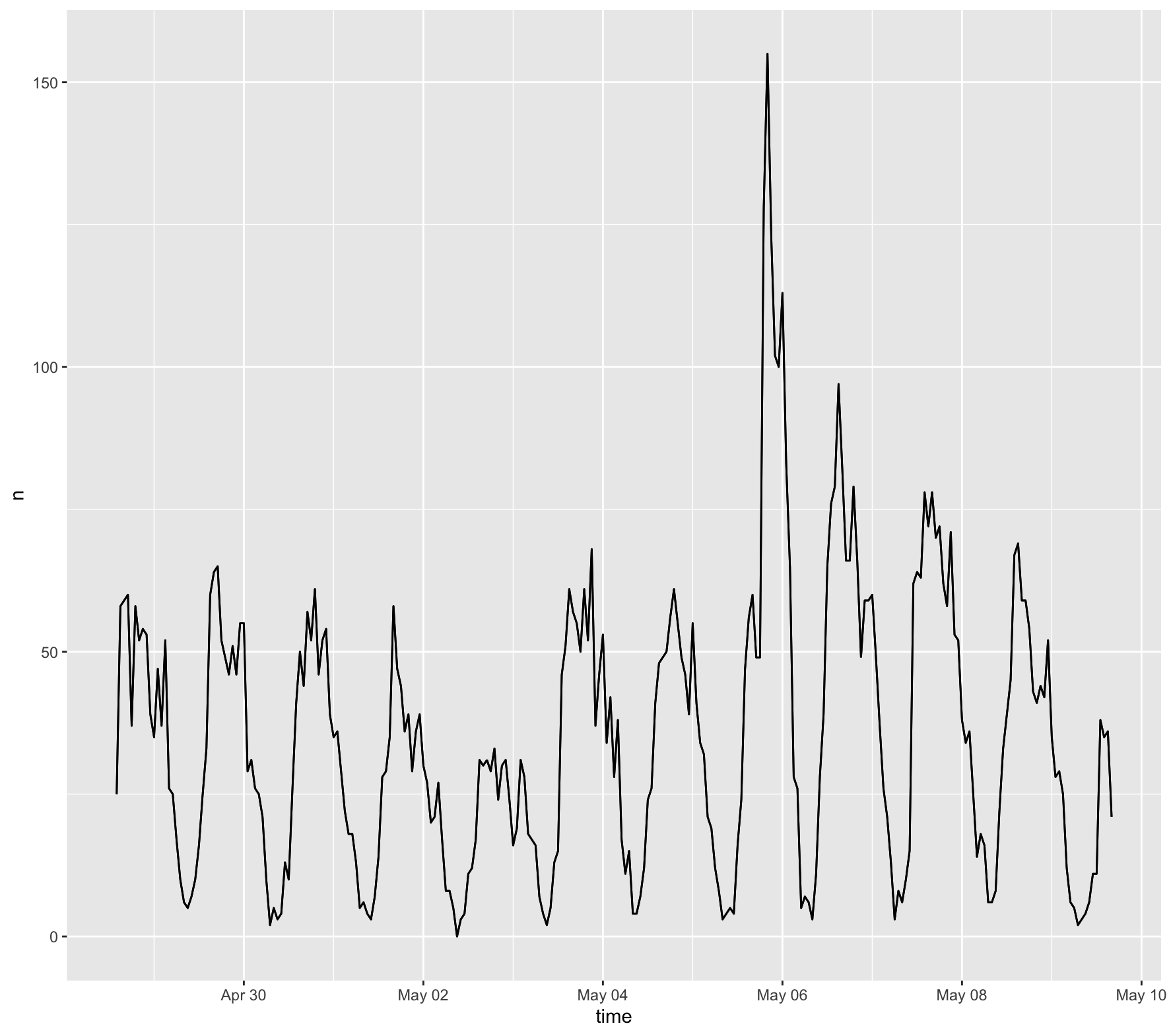
Figure 1 shows the temporal analysis of the collected tweets from the combined dataset
Content Analysis
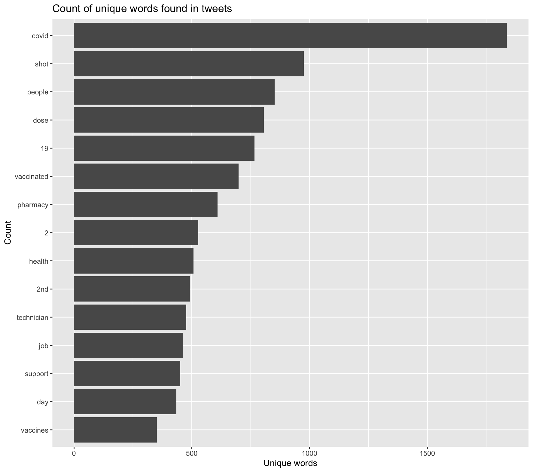
Figure 2 shows the most frequently used words along with vaccine, pfizer, or moderna.
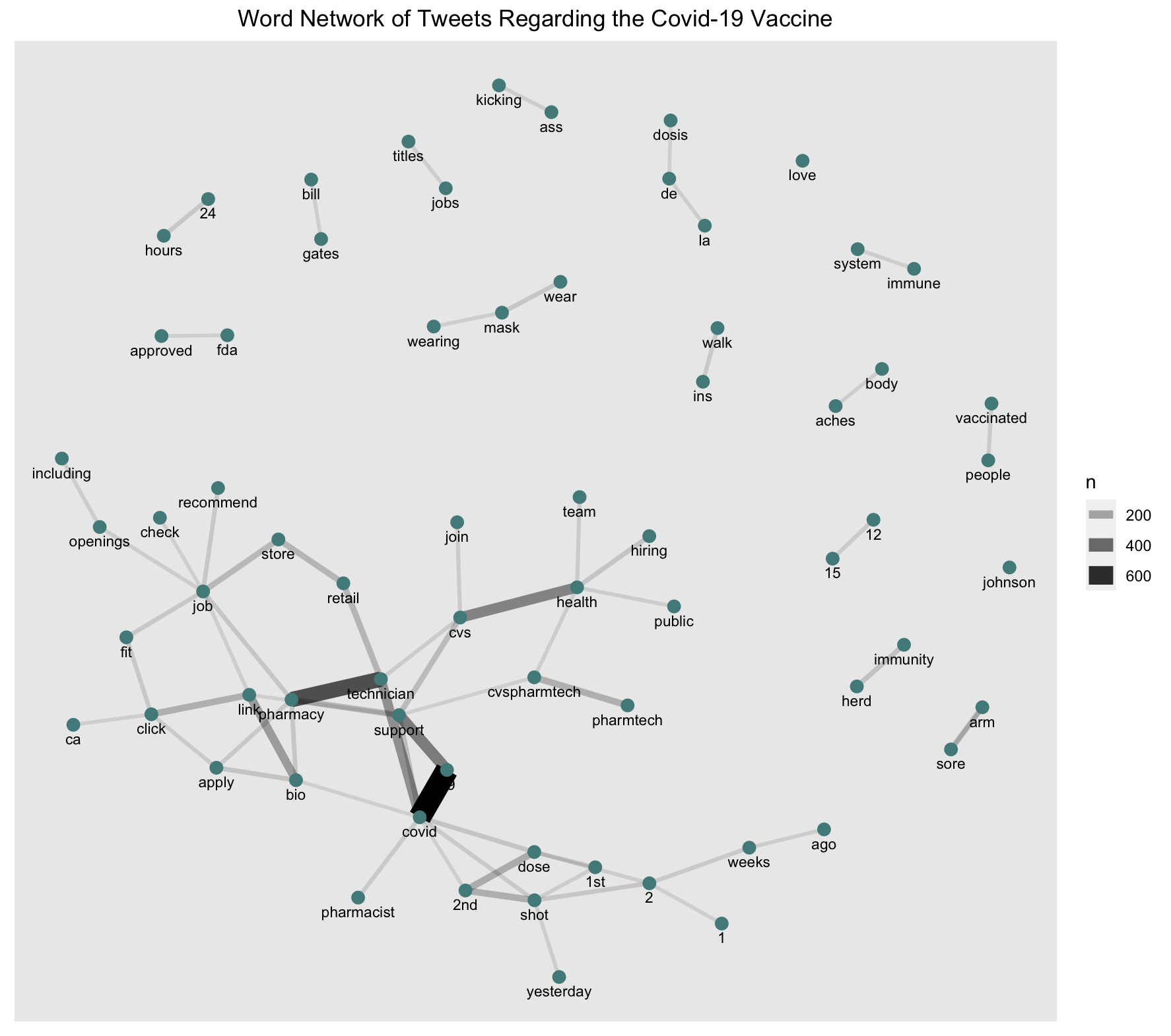
Figure 3 shows the most frequent pairings of words within the Tweets.
Map of Twitter Activity
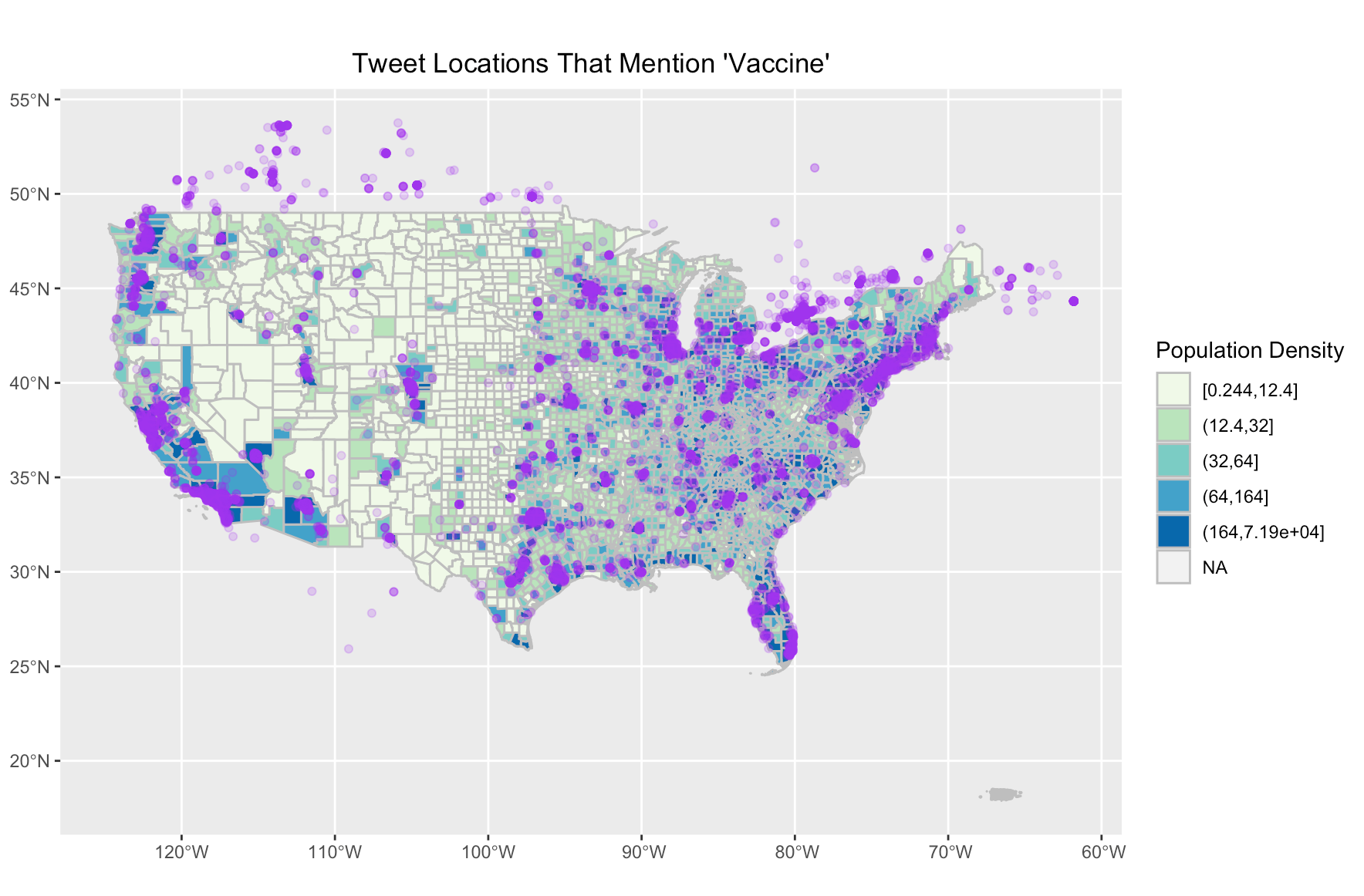
Figure 4 shows the locations of where Tweets mention the vaccine.
Hot Spot Analysis
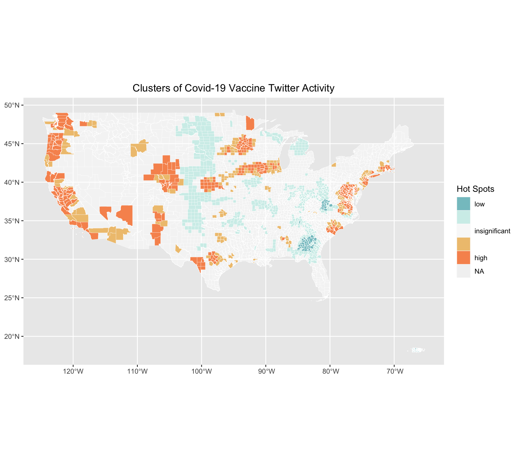
Figure 5 shows the clusters of where Tweets mentioning the vaccine are.
Covid-19 Vaccination Rate by County
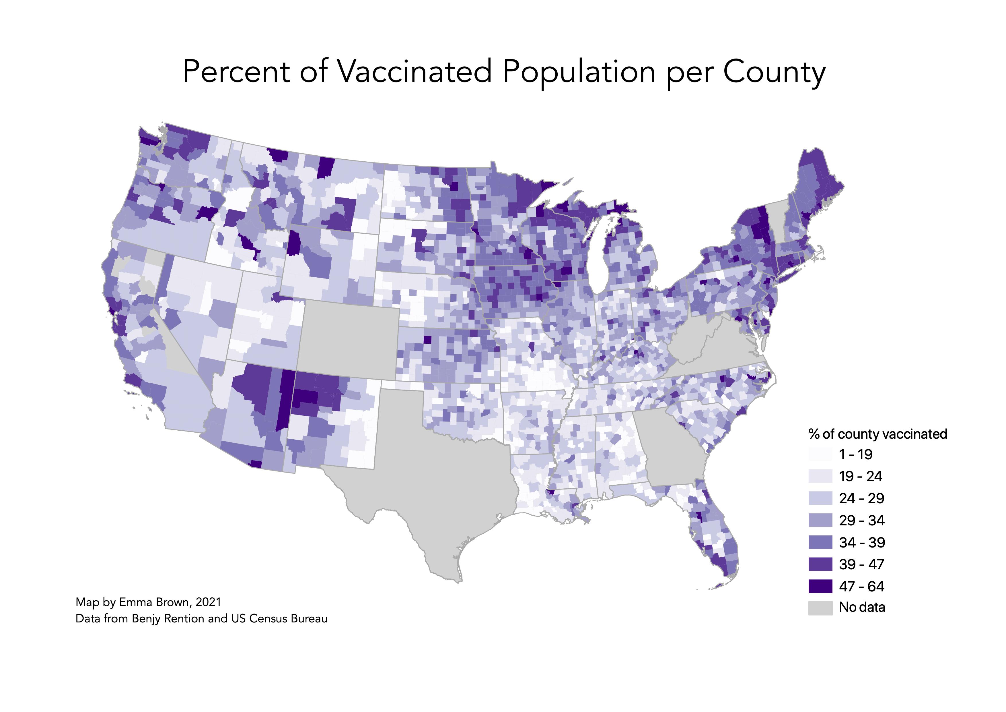
Figure 6 shows a map of COVID-19 vaccination rates in the US. Some states keep poor track of vaccination rates per county, thus I removed counties where less 75% of state records had a county attached so we don’t “artificially depress” the vaccination rate. Thanks Benjy Renton for this tip and data!
Unplanned Deviations from the Protocol
I encountered a number of unplanned deviations from the protocol.
First, the tweets I scraped used the key words “vaccine,” “moderna” and “pfizer,” which does not account for tweets specifically regarding the Johnson and Johnson vaccine. Further, including the key word “vaccination” would have made for a more thorough search.
Another notable unplanned deviation were issues encountered when merging the two sets of vaccine tweet data to create a database for the entire country. Because there was overlap in the region we scraped This was done using an anti join, which removed from my dataset all the duplicate tweets from the second dataset. I then joined this new dataset with Hannah’s to create a full dataset encompassing the whole country. However, a user is only able to scrape tweets from the leading 6 days, and because Hannah and I scraped our tweets on different days, our data is slightly inaccurate. It is uncertain how different the results would be had we scraped the data on the same days. Thus, while our timelines were slightly off, it is overall representative from April 27 to May 10. It is interesting, however to note that where our data overlaps (in middle of the country), there are low rates of tweets about the vaccine (figure 5). This is interesting considering that this part of the country is where we would potentially expect a higher count of tweets, because of the overlapping temporal windows. Even though we removed duplicate tweets, there is still a chance that there are more tweets in this area than if it was scraped on the same day. This may suggest that there are lower rates of vaccine-related tweets in middle America than what is shown on the map, because this area is that shows tweets from a larger timeframe.
Discussion
The temporal analysis shows a spike in tweets regarding the vaccine around May 6th. This was an interesting finding, considering there were no notable changes in vaccination policy or rollout on that day. After some research, I found that May 6th is National Nurse Day, which could have contributed to a higher count of tweets about the vaccine. However, this cannot be concluded without a closer look at the tweets. Looking at the content analysis, it is unsurprising that “covid” and “shot” top the chart with the highest count (figure 2). The prevalence of “2,” and “2nd” indicates that tweets likely relate to second dosages, alluding to the fact that many users are on the road to being fully vaccinated. The hot spot analysis (figure 5) and vaccination rate map (figure 6) are of particular importance when answering the initial study question, which is if patterns of social media activity about the Covid-19 vaccine is representative of vaccination rates. When comparing the two figures, there is some indication that these may be related. Areas along the West coast of the US have a higher vaccination rate, and the Twitter hotspot map indicates that there are high levels of tweets about the vaccine in those areas as well. Similarly, areas in the Northeast, as well as the Midwest (parts of Illinois, Iowa and Wisconsin) have high tweet activity and vaccination rates. Contrarily, it appears as though areas with low tweet activity about the vaccine, like the Southeast, have low vaccination rates. While this is enough to make lofty claims about correlation, it is interesting to note these similarities in both maps.
Conclusion
This analysis explored the question: are patterns of social media activity about the Covid-19 vaccine representative of Covid-19 vaccination rates? The findings suggest that this may be the case! While the lack of data and tweets certainly contribute to uncertainty and error in the analysis, there are similarities in the maps that indicate that areas with high Twitter activity coincide with areas with higher vaccination rates.
This lab illustrates that while Twitter data can be an effective way of analyzing disaster events, as seen in Wang et al. (2016)’s study, it is also an interesting way to analyze social trends. While this analysis can certainly be improved, it provides some insight to how trends of twitter activity about Covid-19 vaccines relate to actual vaccination rates. However, as mentioned earlier, it is important to think about the ethical concerns that arise when using Twitter data, as I discuss further here. This is especially pertinent when analyzing data related to more serious or devastating events.
References
Include any referenced studies or materials in the AAG Style of author-date referencing.
Report Template References & License
This template was developed by Peter Kedron and Joseph Holler with funding support from HEGS-2049837. This template is an adaptation of the ReScience Article Template Developed by N.P Rougier, released under a GPL version 3 license and available here: https://github.com/ReScience/template. Copyright © Nicolas Rougier and coauthors. It also draws inspiration from the pre-registration protocol of the Open Science Framework and the replication studies of Camerer et al. (2016, 2018). See https://osf.io/pfdyw/ and https://osf.io/bzm54/
Camerer, C. F., A. Dreber, E. Forsell, T.-H. Ho, J. Huber, M. Johannesson, M. Kirchler, J. Almenberg, A. Altmejd, T. Chan, E. Heikensten, F. Holzmeister, T. Imai, S. Isaksson, G. Nave, T. Pfeiffer, M. Razen, and H. Wu. 2016. Evaluating replicability of laboratory experiments in economics. Science 351 (6280):1433–1436. https://www.sciencemag.org/lookup/doi/10.1126/science.aaf0918.
Camerer, C. F., A. Dreber, F. Holzmeister, T.-H. Ho, J. Huber, M. Johannesson, M. Kirchler, G. Nave, B. A. Nosek, T. Pfeiffer, A. Altmejd, N. Buttrick, T. Chan, Y. Chen, E. Forsell, A. Gampa, E. Heikensten, L. Hummer, T. Imai, S. Isaksson, D. Manfredi, J. Rose, E.-J. Wagenmakers, and H. Wu. 2018. Evaluating the replicability of social science experiments in Nature and Science between 2010 and 2015. Nature Human Behaviour 2 (9):637–644. http://www.nature.com/articles/s41562-018-0399-z.